Before you ever heard the first line of dialogue, before the lights dimmed and the projector rattled to life, you met the movie poster. A single sheet of paper glued to a wall or slipped into a frame stood there whispering: this is what you’re about to feel.
Since first drafting this piece, the movie-poster world lost one of its greatest visionaries—Drew Struzan—whose brushwork defined an entire generation of cinematic wonder. If you’ve seen the posters for Big Trouble in Little China, The Goonies, Back to the Future, all three Indiana Jones movies, or Star Wars, then you’ve seen his work. His paintings weren’t just promotional—they were portals. News of his passing only deepened the resolve to write this essay, to honor that vanishing moment in time when advertising was still art, and art still felt personal.</span
That was the beauty of it: A movie poster wasn’t just promotional. It was a handshake between the film and its audience—a promise in ink and pigment. And for decades, it was the closest thing a movie had to a soul outside the theater.
Five. Four. Three. Two. One.
Despite the increasing decline in in-person screenings and the emphasis on straight-to-streaming releases, it’s not yet time to call the curtain on the movie poster. There are many things we can still learn from one of the advertising industry’s original blockbuster hit methods.
The first film poster appeared in 1895, less than a decade after the first film flickered onto a wall. That still stuns me. It took nearly forty years for someone to melt cheese over a hamburger, but barely ten for filmmakers to realize they needed something bold and beautiful to lure us in. The bond between cinema and the poster was instantaneous, almost inevitable.
In those early days, posters were plainspoken—handmade broadsheets announcing times and places. But as the medium grew, so did the art. Stars were born, colors sharpened, and by the 1930s, posters had stopped being simple announcements. They had become miniature epics.
And if you were a child of the ’70s or ’80s, you remember when those epics leapt off the wall.
Envisioning this may be an exercise in futility for anyone younger than, say, 35-40 years of age, but let’s revisit 1977. There is no internet, no computers, and no cell phones. If you were to be entertained and informed, you had the following options:
- Live/in-person, i.e., going to the cinema or theater.
- Radio
- Newspaper/Periodical
- Television—In 1977, the majority of America was still tuning an antenna in hopes of watching their local ABC, NBC, or CBS affiliate (and that still depended on the weather). If you were lucky and had parents who didn’t mind paying for this new thing called cable TV, you were overwhelmed with a whopping 12 channels to choose from.
Recently, our resident Gen-X officemate at BREAD shared the first time a movie poster ever stopped him in his tracks. He was six years old, standing in line with his dad for a Disney matinee sometime in 1977. While they waited, he turned and saw it—the one that would forever burn itself into his imagination: Star Wars. Luke Skywalker, lightsaber raised to the heavens, Princess Leia at his side, ships streaking across a galactic backdrop, and the shadow of a villain looming above it all. “It wasn’t a photograph,” he said, “and it sure wasn’t a still frame. It was a painting—a promise of something far more epic than you could even dream at six years old.”
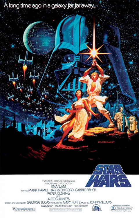
These weren’t just posters. They were icons. Cultural markers that stood on their own as works of art, equal parts marketing and mythology. They didn’t simply sell you on a film. They baptized you into a world.
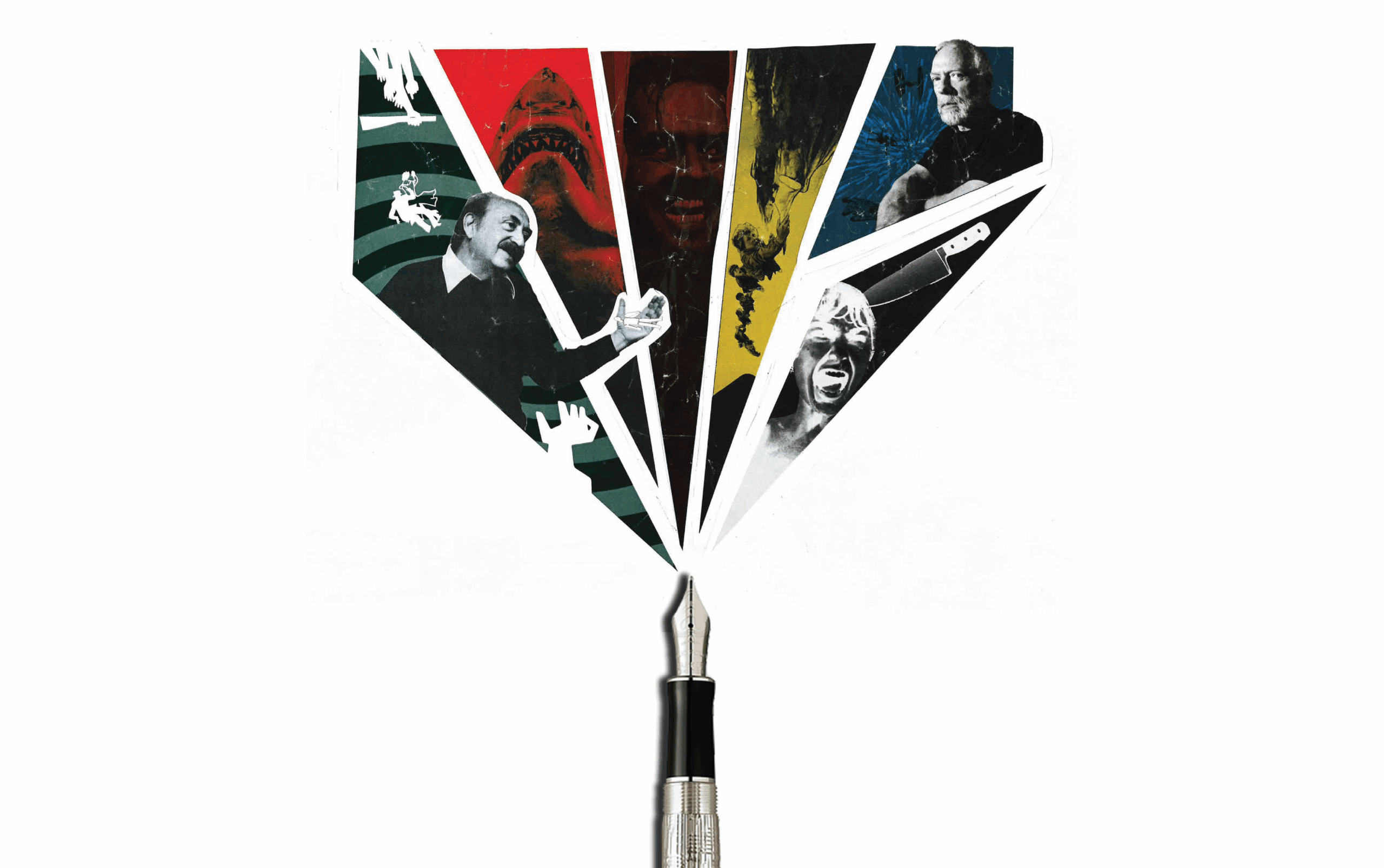
The golden age of movie posters was a cultural fever dream. Saul Bass turned a spiral into vertigo itself. Drew Struzan stacked a ragtag crew of children dangling from a stalactite and sold you adventure before you ever knew what a “Goonie” was. A shark fin rising toward an unsuspecting swimmer told you in one glance what two hours of celluloid would be about: scale, suspense, survival.
These images didn’t just decorate—they imprinted. They became as much a part of the cultural memory as the films themselves, and sometimes even more.
Lessons Hiding in Plain Sight
- Composition tells the story. Jaws didn’t need exposition. A shark, a swimmer, the endless deep. Suspense in a single frame.
- Color carries the emotion. Vertigo’s spiral wasn’t just orange ink—it made you feel dizzy, off balance, already trapped.
- Typography matters more than you think. the pulp-magazine grit of Pulp Fiction’s yellow typeface, the sleek chrome of Star Wars. Switch the fonts on Bill & Ted’s Excellent Adventure and Dead Poets Society, and you’ve got nonsense.
That’s not style. That’s substance.
But not every era honored that. Somewhere along the way—probably around the time superhero franchises learned the word “cinematic universe”—posters lost their voice. Instead of intrigue, they gave us inventory. Cast after cast crammed into Photoshop collages, all floating in front of the same blue-gray explosion. These were roll calls, not stories. The handshake became a shove.
Thankfully, the story doesn’t end with Marvel’s kitchen sink. In the last decade, smaller studios have resurrected the craft. A24 and Blumhouse, in particular, have reminded us what posters can be when they’re treated like art again. Look at Hereditary—an image so stark and unsettling that you feel dread before you know the plot. Or Get Out, with nothing more than Daniel Kaluuya’s mid-scream frozen on glossy paper. No monsters, no clutter. Just raw emotion that makes your stomach drop. Even Everything Everywhere All at Once—a poster as layered and frenetic as the movie—managed to feel like a promise instead of chaos.
These works remind us of what posters once were and still can be: experiences in themselves. They don’t just sell. They prepare you. They spark curiosity, set the tone, and prime you for the story to come.
That’s the romance of it. Long before YouTube trailers and algorithmic ads, a poster was often all you had. It hung in the lobby or the window, sometimes months before release, staring at you until curiosity turned into anticipation. You carried it home in your head, maybe even on your bedroom wall, long after the credits rolled.
And maybe that’s the real tragedy of the digital age. We scroll past pixels now—shrunk to thumbnails, optimized for mobile, devoured in seconds. But a great poster asked you to stop. To stare. To imagine. It was a cultural artifact you could pin up, crease, tear, treasure—a time machine in paper form.
Takeaways for the Rest of Us
- Tell, don’t show everything. Intrigue sells better than overexposure.
- Use color with intent. A palette sets the mood before a single word.
- Respect type. Fonts aren’t decoration; they’re tone.
- Simplify. When you try to say everything, you say nothing.
- Know your audience. A horror poster and a rom-com poster don’t talk to the same people.
It’s easy to say posters are quaint relics. But look closer, and you’ll see their DNA in every good campaign we run today: a single bold idea, a color palette that carries more weight than words, and simplicity that dares to trust its audience. These weren’t just pretty pictures—they were lessons in how to connect.
More than a century ago, movie posters proved something that still holds: the best advertising doesn’t shout. It doesn’t clutter. It dares to believe that one striking image is enough to carry the weight.
They don’t just sell a story. They become the story.
And that’s a legacy worth hanging onto—even if the theater walls aren’t what they used to be.
Before you go, here are some of the BREAD crew’s favorite movie posters:
Kelsey F. – Marketing Project Director
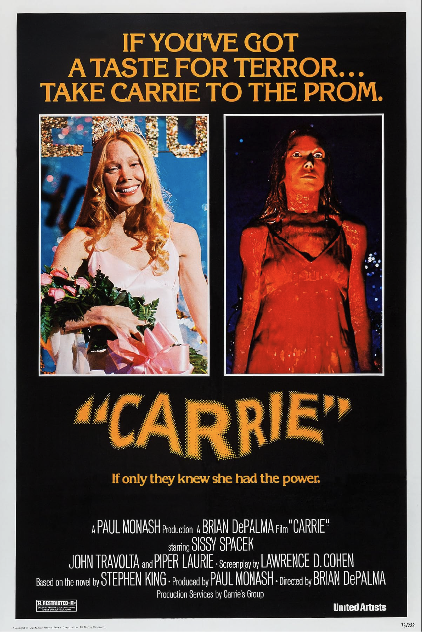
Okay, tough choice, but I think I have to say Carrie (1976)—first, the text. The large phrase at the top makes you think she’s the problem. Then, if you notice the finer print under the movie title, you may start to wonder if everyone else is the issue. While they shouldn’t have been awful to her in the first place, if they knew what she could do, they DEFINITELY wouldn’t have treated her so badly. Lesson: We can’t understand what is going on in others’ lives, and we also never know what the consequences of our actions will be, so it’s best to be kind and treat others well.
Then the imagery – perfection. The comparison of Carrie seconds before the “moment” to Carrie seconds after? Chef’s kiss. The stark contrast of every aspect. Blonde hair, pale skin, light dress—all darkened and “ruined” by the blood. The crown and flowers—symbols that her classmates had accepted her—gone. She’s looking down, making eye contact, in a relaxed pose, feeling connected to those around her – then her body is rigid with a blank stare, focused above the crowd, void of all feelings.
Hannah C. – Brand Designer
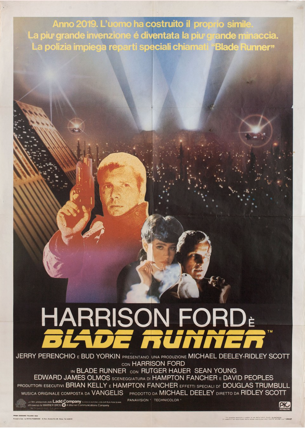
My favorite movie poster is the poster for the original 1982 Blade Runner. Not only is Blade Runner my favorite film (so I’m pretty partial to this poster), but it captures the uniquely moody atmosphere of the film’s world so well. The hand-painted portraits and minute details are so lush and richly saturated, and nothing is minimized for the sake of simplicity or cleanliness. I also love the wordmark at the bottom; the bright red color still manages to stand out despite the busy main illustration. It’s also just a very classic kind of poster for this genre with the stacked portraits and dramatic cityscape, echoing similar designs for other popular sci-fi film franchises of the time, like Star Wars or Alien, while still speaking to the very unique subgenre that the film is going for.
Jordan C. – Advertising Designer
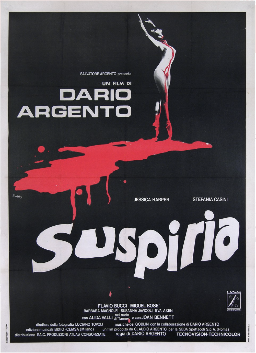
One of my absolute favorite movie posters is Mario de Berardinis’ design for Dario Argento’s Suspiria (1977). It’s beautifully and hauntingly simplistic. The stark black background makes the blood-red splatter trailing from the ballerina almost shocking. In just one image, it tells you so much about what you’re stepping into: gore, suspense, and a film that’s as visually striking as it is unsettling.
What I love most is how it balances elegance and horror. The ballerina is graceful, but the blood makes you uneasy. That contrast is such clever storytelling through design, and it’s what makes this poster unforgettable.
Mandy W. -UI and Web Designer
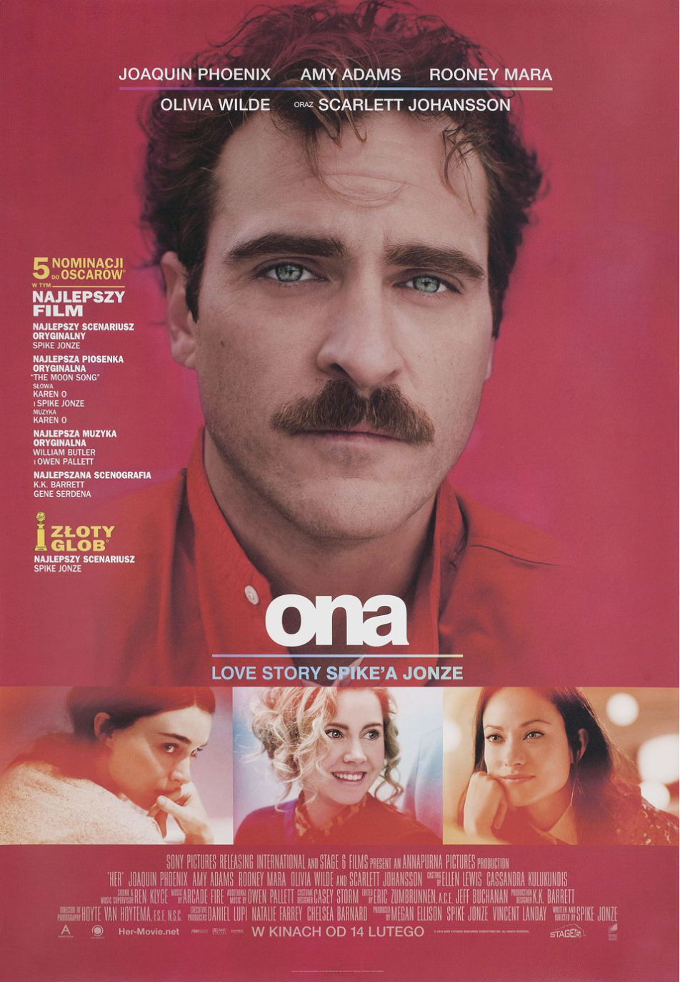
The poster for HER, ‘cause: Joaquin Phoenix (duh). It’s a fantastic movie. The poster design featuring the main character’s massive headshot communicates his moody vibe well. The photo looks almost sad, which is nicely paired with the much smaller, lowercase title at the bottom. And the coloring is done wonderfully with a bold red background, a matching red shirt, and his striking blue eyes. I love it.


